Recipes#
This notebook is a collection of recipes; useful data manipulations or plots commonly used by users.
[1]:
import osyris
import numpy as np
import matplotlib.pyplot as plt

path = "osyrisdata/starformation"
data5 = osyris.RamsesDataset(5, path=path).load()
data8 = osyris.RamsesDataset(8, path=path).load()
Processing 12 files in osyrisdata/starformation/output_00005
 16% : read      66231 cells,          0 particles
 25% : read      90984 cells,          0 particles
 33% : read     120086 cells,          0 particles
 41% : read     149389 cells,          0 particles
 50% : read     173373 cells,          0 particles
 66% : read     239603 cells,          0 particles
 75% : read     264365 cells,          0 particles
 83% : read     293459 cells,          0 particles
 91% : read     318216 cells,          0 particles
Loaded: 346746 cells, 0 particles.
Processing 12 files in osyrisdata/starformation/output_00008
 16% : read      65623 cells,          0 particles
 25% : read      90140 cells,        956 particles
 33% : read     118232 cells,        956 particles
 41% : read     147100 cells,        956 particles
 50% : read     170244 cells,       2109 particles
 66% : read     235859 cells,       2109 particles
 75% : read     260384 cells,       3065 particles
 83% : read     288476 cells,       3065 particles
 91% : read     312840 cells,       4217 particles
Loaded: 340488 cells, 4218 particles.
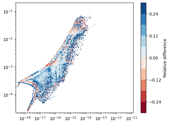
Difference between two snapshots: histograms#
Here, we want to make a map of the difference in 2D histograms between two snapshots (outputs 5 and 8). Because we do not necessarily have the same number of cells at the same place, we first have to make uniform 2D maps using the hist2d function, which we can then directly compare.
The hist2d function actually returns an object that contains the raw data that was used to create the figure. By using the plot=False argument, we can silence the figure generation, and use the data in a custom figure.
Note: For the comparison to make sense, both histograms have to use the same horizontal and vertical range.
[2]:
hist5 = osyris.hist2d(
    data5["mesh"]["density"],
    data5["mesh"]["B_field"],
    norm="log",
    loglog=True,
    plot=False,
)

hist8 = osyris.hist2d(
    data8["mesh"]["density"],
    data8["mesh"]["B_field"],
    norm="log",
    loglog=True,
    plot=False,
)

# Get x,y coordinates
x = hist5.x
y = hist5.y

# Difference in counts
counts5 = np.log10(hist5.layers[0]["data"])
counts8 = np.log10(hist8.layers[0]["data"])
diff = (counts5 - counts8) / counts8

# Create figure
fig, ax = plt.subplots()
cf = ax.contourf(x, y, diff, cmap="RdBu", levels=np.linspace(-0.3, 0.3, 11))
cb = plt.colorbar(cf, ax=ax)
cb.ax.set_ylabel("Relative difference")
ax.set_xscale("log")
ax.set_yscale("log")
/tmp/ipykernel_2225/1702012632.py:22: RuntimeWarning: divide by zero encountered in log10
  counts5 = np.log10(hist5.layers[0]["data"])
/tmp/ipykernel_2225/1702012632.py:23: RuntimeWarning: divide by zero encountered in log10
  counts8 = np.log10(hist8.layers[0]["data"])
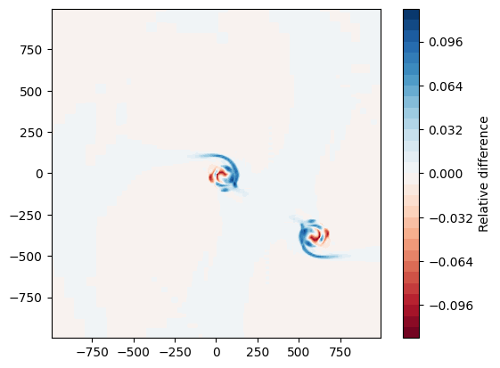
Difference between two snapshots: spatial maps#
Here, we want to make a map of the difference in density between two snapshots. The map function also returns an object that contains the raw data that was used to create the figure. By using the plot=False argument, we can silence the figure generation, and use the data in a custom figure.
Note: For this to make sense, the two outputs have to be centered around the same center point.
[3]:
# Find center
ind = np.argmax(data8["mesh"]["density"])
center = data8["mesh"]["position"][ind]

kwargs = dict(
    dx=2000 * osyris.units("au"), origin=center, direction="z", norm="log", plot=False
)

# Extract density slices by copying data into structures
plane5 = osyris.map(data5["mesh"].layer("density"), **kwargs)

plane8 = osyris.map(data8["mesh"].layer("density"), **kwargs)

# Get x,y coordinates
x = plane5.x
y = plane5.y

# Density difference
rho5 = np.log10(plane5.layers[0]["data"])
rho8 = np.log10(plane8.layers[0]["data"])
diff = (rho5 - rho8) / rho8

# Create figure
fig, ax = plt.subplots()
cf = ax.contourf(x, y, diff, cmap="RdBu", levels=np.linspace(-0.12, 0.12, 31))
cb = plt.colorbar(cf, ax=ax)
cb.ax.set_ylabel("Relative difference")
ax.set_aspect("equal")
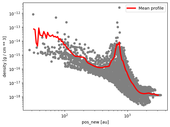
Radial profile#
This example shows how to make a 1D profile of the mean gas density as a function of radius.
[4]:
# Re-center cell coordinates according to origin
data8["mesh"]["pos_new"] = (data8["mesh"]["position"] - center).to("au")

# Create figure
fig, ax = plt.subplots()

# Make scatter plot as radial profile
step = 100
osyris.scatter(
    data8["mesh"]["pos_new"][::step],
    data8["mesh"]["density"][::step],
    color="grey",
    edgecolors="None",
    loglog=True,
    ax=ax,
)

# Define range and number of bins
rmin = 1.5
rmax = 3.5
nr = 100

# Radial bin edges and centers
edges = np.linspace(rmin, rmax, nr + 1)
midpoints = 0.5 * (edges[1:] + edges[:-1])

# Bin the data in radial bins
z0, _ = np.histogram(np.log10(data8["mesh"]["pos_new"].norm.values), bins=edges)
z1, _ = np.histogram(
    np.log10(data8["mesh"]["pos_new"].norm.values),
    bins=edges,
    weights=data8["mesh"]["density"].values,
)
rho_mean = z1 / z0

# Overlay profile
ax.plot(10.0**midpoints, rho_mean, color="r", lw=3, label="Mean profile")
ax.legend()
/tmp/ipykernel_2225/1683163360.py:28: RuntimeWarning: divide by zero encountered in log10
  z0, _ = np.histogram(np.log10(data8["mesh"]["pos_new"].norm.values), bins=edges)
/tmp/ipykernel_2225/1683163360.py:30: RuntimeWarning: divide by zero encountered in log10
  np.log10(data8["mesh"]["pos_new"].norm.values),
[4]:
<matplotlib.legend.Legend at 0x78689c4c33d0>