Plotting: histograms#
In this notebook, we illustrate the possibilities of plotting 1D and 2D histograms.
Note that Osyris’s plotting functions are wrapping Matplotlib’s plotting functions, and forwards most Matplotlib arguments to the underlying function.
[1]:
import osyris
import numpy as np
import matplotlib.pyplot as plt

path = "osyrisdata/starformation"
data = osyris.RamsesDataset(8, path=path).load()
mesh = data["mesh"]
Processing 12 files in osyrisdata/starformation/output_00008
 16% : read      65623 cells,          0 particles
 25% : read      90140 cells,        956 particles
 33% : read     118232 cells,        956 particles
 41% : read     147100 cells,        956 particles
 50% : read     170244 cells,       2109 particles
 66% : read     235859 cells,       2109 particles
 75% : read     260384 cells,       3065 particles
 83% : read     288476 cells,       3065 particles
 91% : read     312840 cells,       4217 particles
Loaded: 340488 cells, 4218 particles.
1D histograms#
The hist1d function provides a simple way to make 1D histogram plots. When a vector quantity is supplied, by default hist1d will use the norm of the vectors.
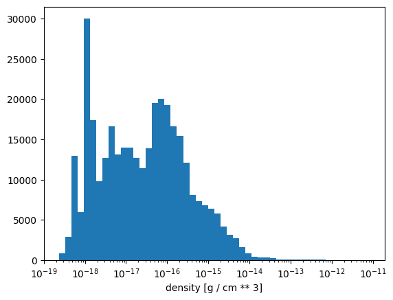
A 1D histogram of gas density#
For example, to plot a histogram of the gas density, simply do
[2]:
osyris.hist1d(mesh["density"], logx=True)
[2]:
<osyris.core.plot.Plot at 0x7a6ad41bf0a0>
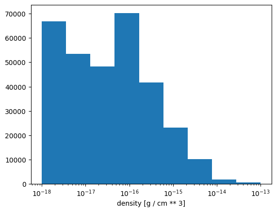
Specifying the bins#
The bin edges can be specified using the bins parameter, which can either be an integer number or an array (similarly to Numpy’s bins argument):
[3]:
osyris.hist1d(mesh["density"], logx=True, bins=np.logspace(-18.0, -13.0, 10))
[3]:
<osyris.core.plot.Plot at 0x7a6a9c268850>
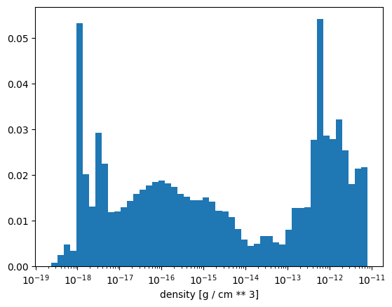
Weighted histogram#
By default, hist1d will show a binned count of cells, but it does also support weights. For example, creating a mass-weighted histogram of the gas density can be achieved via
[4]:
mesh["mass"] = (mesh["density"] * (mesh["dx"] ** 3)).to("M_sun")
osyris.hist1d(mesh["density"], weights=mesh["mass"], logx=True)
[4]:
<osyris.core.plot.Plot at 0x7a6a99c444f0>
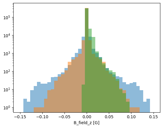
Multiple 1D histograms#
Multiple histograms can be over-plotted on the same axes by using multiple layers:
[5]:
bins = np.linspace(-0.15, 0.15, 40)
osyris.hist1d(
    mesh.layer("B_field", alpha=0.5).x,
    mesh.layer("B_field", alpha=0.5).y,
    mesh.layer("B_field", alpha=0.5).z,
    logy=True,
    bins=bins,
)
[5]:
<osyris.core.plot.Plot at 0x7a6a99989780>
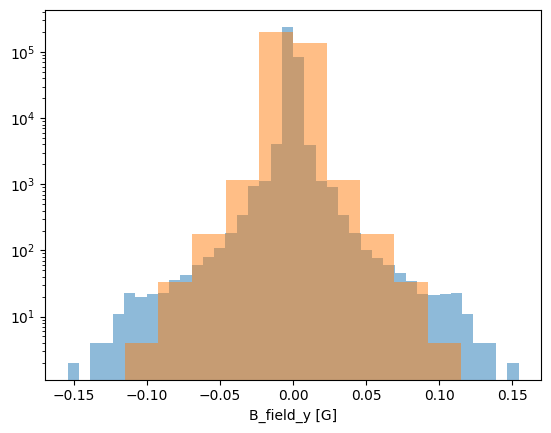
It is also possible to specify different bins for different layers:
[6]:
osyris.hist1d(
    mesh.layer("B_field", alpha=0.5, bins=40).x,
    mesh.layer("B_field", alpha=0.5, bins=10).y,
    logy=True,
)
[6]:
<osyris.core.plot.Plot at 0x7a6a99901cf0>
2D histograms#
The hist2d function can be used to make 2D histograms with two different quantities as input. When a vector quantity is supplied, by default hist2d will use the norm of the vectors
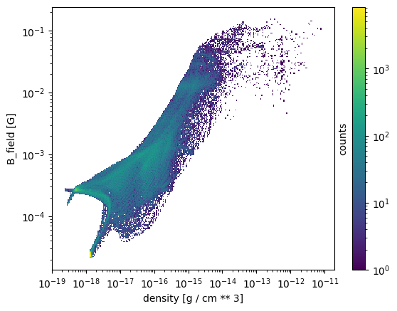
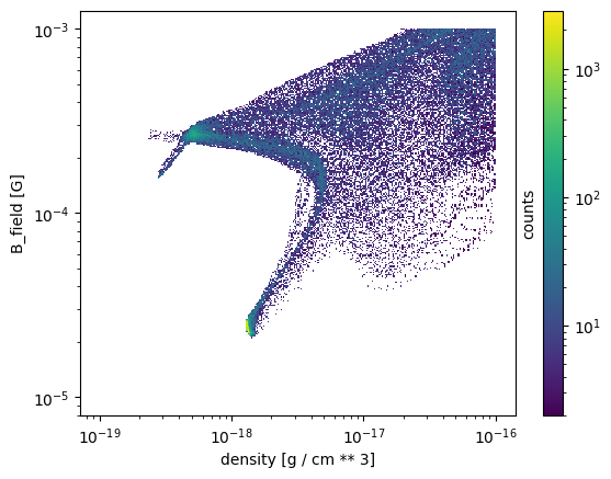
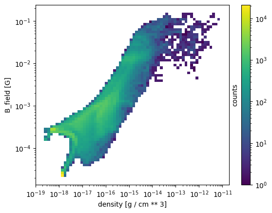
A 2D histogram of gas density vs magnetic field magnitude#
To create a 2D histogram of gas density vs magnetic field magnitude, use
[7]:
osyris.hist2d(mesh["density"], mesh["B_field"], norm="log", loglog=True)
[7]:
<osyris.core.plot.Plot at 0x7a6a99504670>
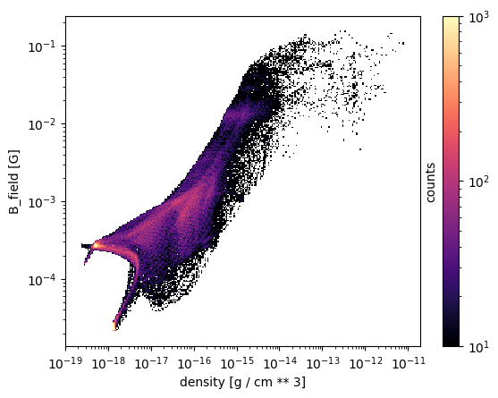
Changing the colorscale#
The colormap and the range of values can be changed as follows.
[8]:
osyris.hist2d(
    mesh["density"],
    mesh["B_field"],
    norm="log",
    loglog=True,
    cmap="magma",
    vmin=10.0,
    vmax=1000.0,
)
[8]:
<osyris.core.plot.Plot at 0x7a6a995d5540>
Controlling the horizontal and vertical range#
To control the range covered by the horizontal and vertical binning, specify the bins manually.
[9]:
osyris.hist2d(
    mesh["density"],
    mesh["B_field"],
    norm="log",
    loglog=True,
    bins=(np.logspace(-19, -16, 301), np.logspace(-5, -3, 301)),
)
[9]:
<osyris.core.plot.Plot at 0x7a6a934de380>
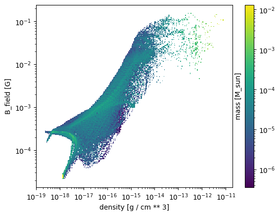
Using a layer for the colormap instead of counting cells#
By default, hist2d will show a binned count of cells. However, the colors can represent the histogram of a supplied Array instead.
[10]:
osyris.hist2d(
    mesh["density"],
    mesh["B_field"],
    mesh.layer("mass", norm="log"),
    loglog=True,
)
[10]:
<osyris.core.plot.Plot at 0x7a6a9318faf0>
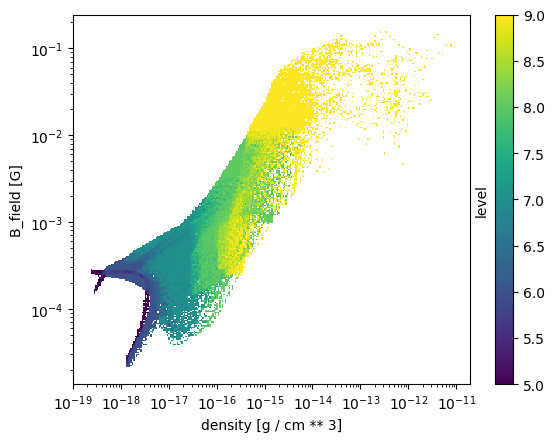
Applying a mean operation inside each bin#
By default, the sum of the layer values in computed inside each bin. It can sometimes be useful to compute the mean inside each bin instead, and this can be done by setting operation='mean'.
For example, we can get a feel for the resolution distribution in our histogram by histogramming the AMR level of the cells, and applying a 'mean' operation inside the pixels.
[11]:
osyris.hist2d(
    mesh["density"],
    mesh["B_field"],
    mesh.layer("level", operation="mean"),
    loglog=True,
)
[11]:
<osyris.core.plot.Plot at 0x7a6a92d7e8c0>
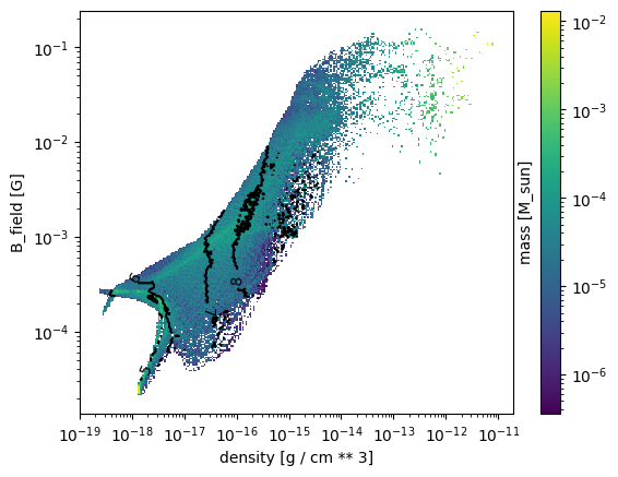
Multiple layers#
One can use any number of layers to overlay, although anything beyond two layers is probably not very useful.
[12]:
osyris.hist2d(
    mesh["density"],
    mesh["B_field"],
    mesh.layer("mass", norm="log"),  # layer 1
    mesh.layer(
        "level",
        operation="mean",
        fmt="%i",
        mode="contour",
        colors="k",
        levels=[5, 6, 7, 8, 9],
    ),  # layer 2
    loglog=True,
)
[12]:
<osyris.core.plot.Plot at 0x7a6a930c28f0>
Controlling the resolution#
By default, the histograms have a resolution of 256x256 pixels. To change the resolution, we use the bins argument:
[13]:
osyris.hist2d(
    mesh["density"],
    mesh["B_field"],
    norm="log",
    loglog=True,
    bins=64,
)
[13]:
<osyris.core.plot.Plot at 0x7a6a92d7f7f0>
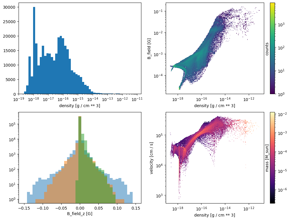
Subplots / tiled plots#
Osyris has no built-in support for subplots (also known as tiled plots). Instead, we leverage Matplotlib’s ability to create such layouts. Osyris plots are then inserted into the Matplotlib axes, using the ax argument.
In the example below, we create four panels and insert various histograms.
[14]:
# Create figure
import matplotlib.pyplot as plt

fig, ax = plt.subplots(2, 2, figsize=(12, 9))

osyris.hist1d(mesh["density"], logx=True, ax=ax[0, 0])
osyris.hist2d(
    mesh["density"],
    mesh["B_field"],
    norm="log",
    loglog=True,
    ax=ax[0, 1],
)
osyris.hist1d(
    mesh["B_field"].x,
    mesh["B_field"].y,
    mesh["B_field"].z,
    alpha=0.5,
    logy=True,
    bins=np.linspace(-0.15, 0.15, 40),
    ax=ax[1, 0],
)
osyris.hist2d(
    mesh["density"],
    mesh["velocity"],
    mesh["mass"],
    norm="log",
    loglog=True,
    cmap="magma",
    ax=ax[1, 1],
)
[14]:
<osyris.core.plot.Plot at 0x7a6a920d03d0>