Plotting: 1D and 2D data#
This notebook show how to visualize 1D and 2d simulation data.
[1]:
import osyris
import numpy as np
import matplotlib.pyplot as plt
Plotting 1D data#
1D and 2D data are loaded in exactly the same way as 3D simulations, by creating a Dataset and calling the load() method.
[2]:
path = "osyrisdata/sod"
data1d = osyris.RamsesDataset(2, path=path).load()
data1d
Processing 4 files in osyrisdata/sod/output_00002
 25% : read         15 cells,          0 particles
 50% : read         47 cells,          0 particles
 75% : read         90 cells,          0 particles
Loaded: 142 cells, 0 particles.
[2]:
Dataset: osyrisdata/sod/output_00002: 7.95 KB

Datagroup: mesh 7.95 KB
'level' Min: 5 Max: 10 [] (142,)
'cpu' Min: 1 Max: 4 [] (142,)
'dx' Min: 9.766e-04 Max: 0.031 [cm] (142,)
'position_x' Min: 0.016 Max: 0.996 [cm] (142,)
'density' Min: 0.125 Max: 1.000 [g / cm ** 3] (142,)
'velocity_x' Min: -5.551e-17 Max: 0.929 [cm / s] (142,)
'pressure' Min: 0.1 Max: 1.000 [erg / cm ** 3] (142,)
'mass' Min: 5.853e-44 Max: 1.534e-38 [M_sun] (142,)
Line profile#
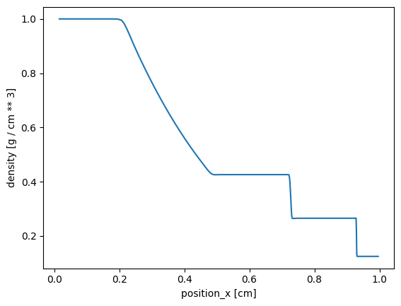
To plot a simple line profile of density as a function of position, Osyris provides the plot function which is analogous to Matplotlib’s plot function.
[3]:
data1d = data1d["mesh"]

osyris.plot(data1d["position_x"], data1d["density"])
[3]:
<osyris.core.plot.Plot at 0x7f9057080df0>
It is also possible to send just a single array to the plot function, in which case it will use it as y values and replace the x axis with integer numbers spanning the length of the array:
[4]:
osyris.plot(data1d["density"])
[4]:
<osyris.core.plot.Plot at 0x7f9054ecaef0>
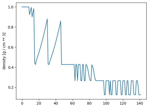
Note that in this case, the order in which the data points are plotted is just the order in which they appear in the output files, i.e. it will most probably not make physical sense, as it depends (among other things) on load-balancing across cpus.
However, these plots can be useful for debugging purposes, when one wishes to visually inspect the range of values spanned by a variable.
Styling lines#
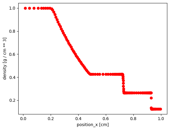
Because the function is based on Matplotlib’s implementation, it also supports Matplotlib’s styling arguments. For instance, to plot using red marker instead of a solid line, you can do
[5]:
osyris.plot(
    data1d["position_x"],
    data1d["density"],
    marker="o",
    ls="None",
    color="red",
)
[5]:
<osyris.core.plot.Plot at 0x7f9054d8c700>
Logarithmic scales#
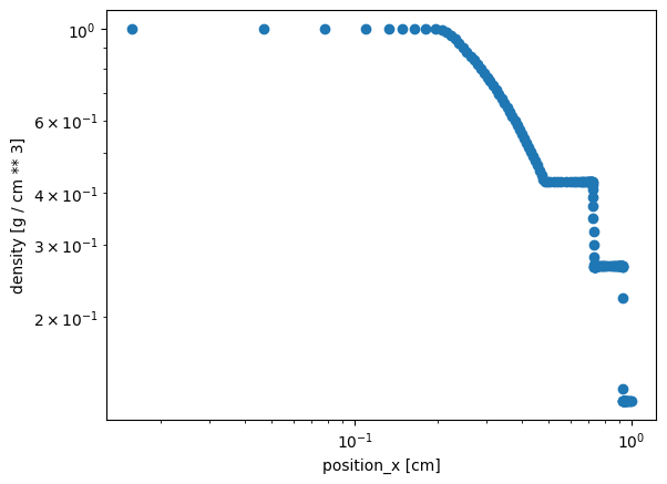
Osyris does provide some convenience arguments in addition to Matplotlib’s functionalty. For example, to set a logarithmic scale on the x and y axes, use the logx and logy arguments
[6]:
osyris.plot(
    data1d["position_x"],
    data1d["density"],
    marker="o",
    ls="None",
    logx=True,
    logy=True,
)
[6]:
<osyris.core.plot.Plot at 0x7f9054dfd0c0>
Multiple lines#
It is also possible to over-plot multiple lines in one go, by supplying more than one array for the y values.
However, note that to be able to plot the variables on a single axis, they must all have the same unit.
[7]:
try:
    osyris.plot(
        data1d["position_x"],
        data1d["density"],
        data1d["pressure"],
    )
except Exception as e:
    print(e)
Different layers in 1D plots must all have the same unit.
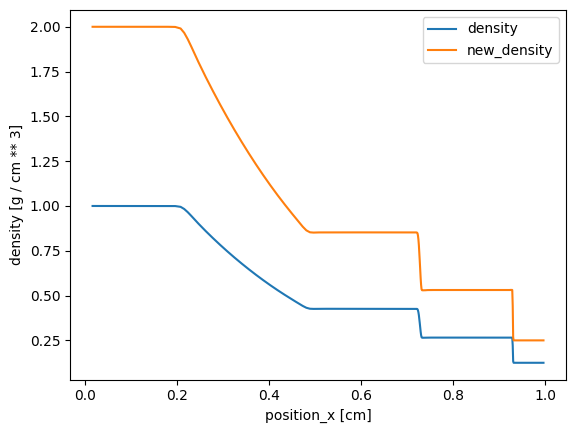
To be able to show an example, we fake a new density variable.
[8]:
data1d["new_density"] = data1d["density"] * 2
osyris.plot(
    data1d["position_x"],
    data1d["density"],
    data1d["new_density"],
)
[8]:
<osyris.core.plot.Plot at 0x7f9054a6fa30>
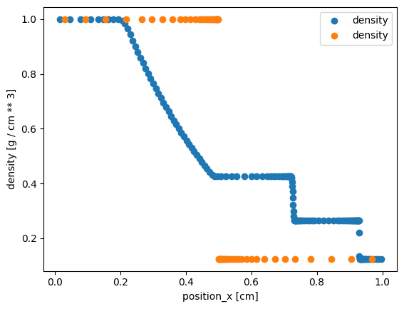
By default, the same x coordinate will be used for both sets of y values. It is however possible to plot on the same axes two variables with different x coordinates.
In this case, the two entries must be dicts, and they must contain at least the entries 'x' and 'y'. This is useful in the case where one wishes to compare two outputs from different times, which do not contain the same number of mesh cells (and hence cannot have the same x coordinate).
[9]:
old1d = osyris.RamsesDataset(1, path=path).load()["mesh"]

osyris.plot(
    {"x": data1d["position_x"], "y": data1d["density"]},
    {"x": old1d["position_x"], "y": old1d["density"]},
    marker="o",
    ls="None",
)
Processing 4 files in osyrisdata/sod/output_00001
 25% : read          4 cells,          0 particles
 50% : read         29 cells,          0 particles
 75% : read         54 cells,          0 particles
Loaded: 58 cells, 0 particles.
[9]:
<osyris.core.plot.Plot at 0x7f9054b4a710>
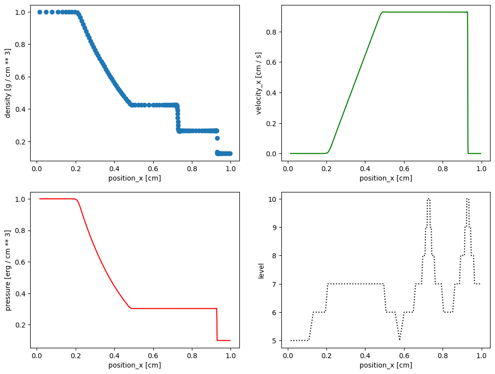
Subplots / tiled plots#
Osyris has no built-in support for subplots (also known as tiled plots). Instead, we leverage Matplotlib’s ability to create such layouts. Osyris plots are then inserted into the Matplotlib axes, using the ax argument.
In the example below, we create four panels and insert various plots.
[10]:
fig, ax = plt.subplots(2, 2, figsize=(12, 9))

osyris.plot(
    data1d["position_x"],
    data1d["density"],
    marker="o",
    ls="None",
    ax=ax[0, 0],
)
osyris.plot(
    data1d["position_x"],
    data1d["velocity_x"],
    color="green",
    ax=ax[0, 1],
)
osyris.plot(data1d["position_x"], data1d["pressure"], color="red", ax=ax[1, 0])
osyris.plot(
    data1d["position_x"],
    data1d["level"],
    color="black",
    ls="dotted",
    ax=ax[1, 1],
)
[10]:
<osyris.core.plot.Plot at 0x7f9054cbce50>
Plotting 2D data#
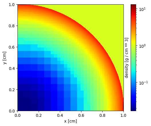
This section briefly shows how to make images of 2D data with the map function. For a full description of all the options available, see Plotting: spatial maps.
[11]:
data2d = osyris.RamsesDataset(2, path="osyrisdata/sedov").load()
Processing 1 files in osyrisdata/sedov/output_00002
Loaded: 34198 cells, 0 particles.
[12]:
data2d["mesh"]
[12]:
Datagroup: mesh 2.46 MB
'level' Min: 4 Max: 10 [] (34198,)
'cpu' Min: 1 Max: 1 [] (34198,)
'dx' Min: 9.766e-04 Max: 0.062 [cm] (34198,)
'density' Min: 0.017 Max: 19.120 [g / cm ** 3] (34198,)
'pressure' Min: 1.000e-05 Max: 1.578 [erg / cm ** 3] (34198,)
'position' Min: 0.044 Max: 1.392 [cm] (34198,), {x,y}
'velocity' Min: 0.0 Max: 0.417 [cm / s] (34198,), {x,y}
'mass' Min: 4.683e-43 Max: 2.971e-38 [M_sun] (34198,)
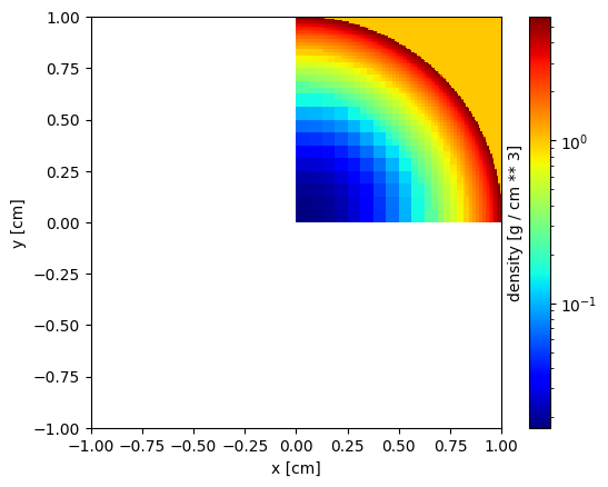
To make an image of the gas density, simply use
[13]:
osyris.map(data2d["mesh"].layer("density"), norm="log", cmap="jet")
[13]:
<osyris.core.plot.Plot at 0x7f9051a69000>
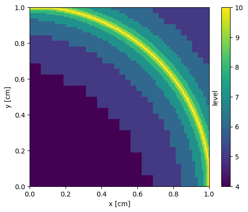
A map of the AMR level is obtained with
[14]:
osyris.map(data2d["mesh"].layer("level"))
[14]:
<osyris.core.plot.Plot at 0x7f9050f1e440>
The size of the viewport can be adjusted with the dx argument:
[15]:
osyris.map(
    data2d["mesh"].layer("density"),
    dx=2 * osyris.units("cm"),
    cmap="jet",
    norm="log",
)
[15]:
<osyris.core.plot.Plot at 0x7f9050d94a00>
Finally, you can also use an additional layer to overlay velocity vectors
[16]:
osyris.map(
    data2d["mesh"].layer("density", norm="log"),
    data2d["mesh"].layer("velocity", mode="vec", color="black"),
    cmap="jet",
)
[16]:
<osyris.core.plot.Plot at 0x7f9051d7b280>
