Plotting: spatial maps#
In this notebook, we illustrate the possibilities of plotting 2D spatial maps.
Note that Osyris’s plotting functions are wrapping Matplotlib’s plotting functions, and forwards most Matplotlib arguments to the underlying function.
[1]:
import osyris
import numpy as np
import matplotlib.pyplot as plt

au = osyris.units("au")

path = "osyrisdata/starformation"
data = osyris.RamsesDataset(8, path=path).load()
mesh = data["mesh"]
ind = np.argmax(mesh["density"])
center = mesh["position"][ind]
Processing 12 files in osyrisdata/starformation/output_00008
 16% : read      65623 cells,          0 particles
 25% : read      90140 cells,        956 particles
 33% : read     118232 cells,        956 particles
 41% : read     147100 cells,        956 particles
 50% : read     170244 cells,       2109 particles
 66% : read     235859 cells,       2109 particles
 75% : read     260384 cells,       3065 particles
 83% : read     288476 cells,       3065 particles
 91% : read     312840 cells,       4217 particles
Loaded: 340488 cells, 4218 particles.
2D slice of a scalar quantity#
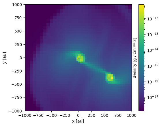
A 2D slice of gas density#
To create a 2D map of a gas density slice 2000 au wide through the plane normal to z, use
[2]:
osyris.map(
    mesh.layer("density"), norm="log", dx=2000 * au, origin=center, direction="z"
)
[2]:
<osyris.core.plot.Plot at 0x7a215eb1f220>
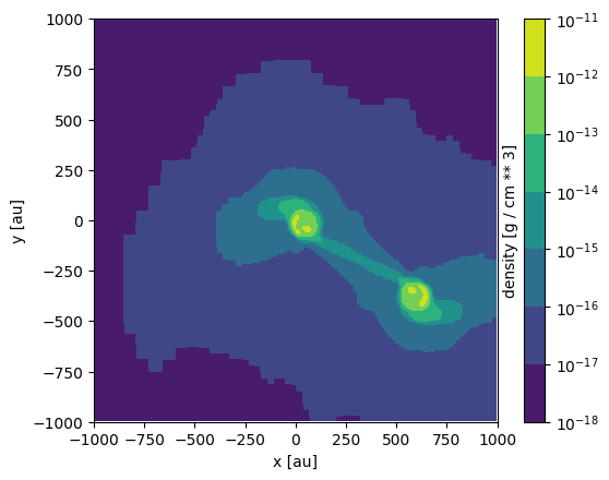
Rendering modes#
By default, the map is rendered as an image, but other rendering modes are available. The possible modes for scalar quantities are image, contourf and contour. For example, the same map using contourf yields
[3]:
osyris.map(
    mesh.layer("density"),
    norm="log",
    dx=2000 * au,
    origin=center,
    mode="contourf",
    direction="z",
)
[3]:
<osyris.core.plot.Plot at 0x7a215de6c790>
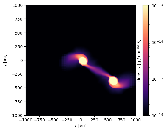
Changing the colorscale#
The colormap and the range of values can be changed as follows.
[4]:
osyris.map(
    mesh.layer("density"),
    norm="log",
    dx=2000 * au,
    origin=center,
    direction="z",
    cmap="magma",
    vmin=1.0e-16,
    vmax=1.0e-13,
)
[4]:
<osyris.core.plot.Plot at 0x7a215dd41e40>
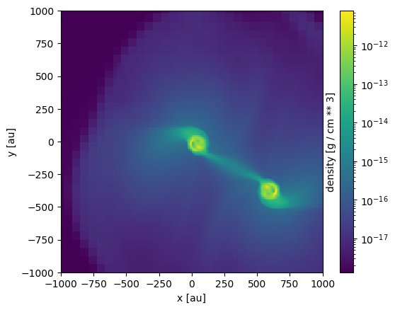
Controlling the resolution#
By default, the maps have a resolution of 256x256 pixels. This can be changed via the keyword argument resolution, which can either be an integer (in which case the same resolution is applied to both the x and y dimension) or a dict with the syntax resolution={'x': nx, 'y': ny}.
[5]:
osyris.map(
    mesh.layer("density"),
    norm="log",
    dx=2000 * au,
    origin=center,
    direction="z",
    resolution=64,
)
[5]:
<osyris.core.plot.Plot at 0x7a215e04e440>
Maps of vector quantities#
By default, if a vector quantity (e.g. gas velocity or magnetic field) is passed to the map function, it will make an image of the magnitude of the vectors.
However, one can also use the vec, stream and lic rendering modes to represent vector Arrays.
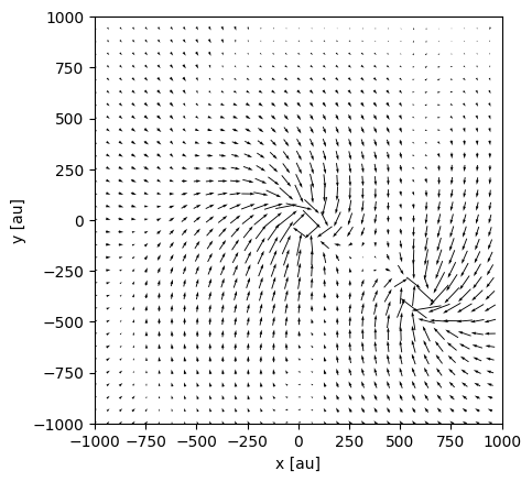
Vector field as arrows (quiver plot)#
The vec mode for the gas velocity produces
[6]:
osyris.map(
    mesh.layer("velocity"),
    mode="vec",
    dx=2000 * au,
    origin=center,
    direction="z",
    color="k",
)
[6]:
<osyris.core.plot.Plot at 0x7a215efa74f0>
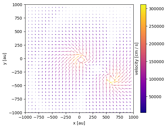
A colormap can be used to color the arrows:
[7]:
osyris.map(
    mesh.layer("velocity"),
    mode="vec",
    color=mesh["velocity"],
    cmap="plasma",
    dx=2000.0 * au,
    origin=center,
    direction="z",
)
[7]:
<osyris.core.plot.Plot at 0x7a215f054670>
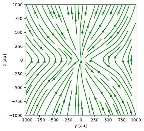
Streamlines#
Streamlines can be plotted using the stream mode:
[8]:
osyris.map(
    mesh.layer("B_field"),
    mode="stream",
    dx=2000 * au,
    origin=center,
    direction="x",
    color="g",
)
[8]:
<osyris.core.plot.Plot at 0x7a215f1f5cc0>
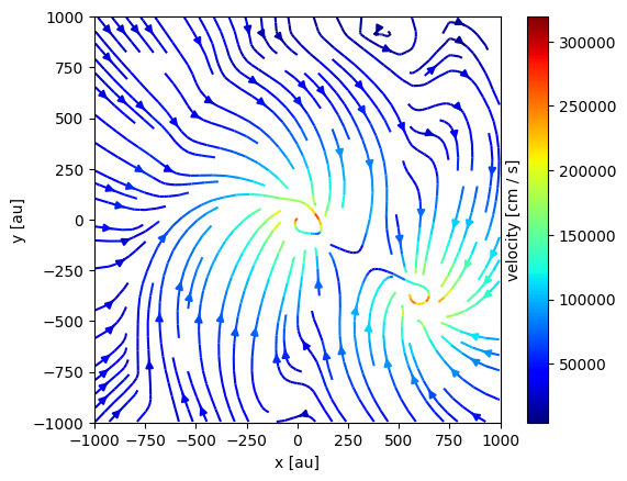
A colormap can be used to color the streamlines:
[9]:
osyris.map(
    mesh.layer("velocity"),
    mode="stream",
    color=mesh["velocity"],
    cmap="jet",
    dx=2000 * au,
    origin=center,
    direction="z",
)
[9]:
<osyris.core.plot.Plot at 0x7a215eb1c190>
Line integral convolution#
The line integral convolution (LIC) visualizations method, although computationally intensive, offers an excellent representation of the vector field (especially near discontinuities).
Note: This feature requires the lic package to be installed.
Below is an example of a LIC of the velocity vector field:
[10]:
osyris.map(
    mesh.layer("velocity", mode="lic"),
    dx=2000 * au,
    direction="z",
    origin=center,
    cmap="binary",
)
[10]:
<osyris.core.plot.Plot at 0x7a215c0b54b0>
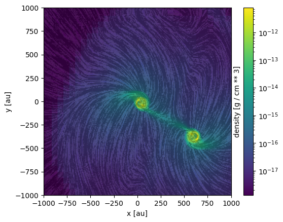
Using an Array for the colors also works on LICs:
[11]:
osyris.map(
    mesh.layer("velocity", mode="lic"),
    color=mesh["density"],
    norm="log",
    dx=2000 * au,
    origin=center,
    direction="z",
)
[11]:
<osyris.core.plot.Plot at 0x7a2155fb2530>
Multiple layers#
More than one quantity can be overlayed on the map, using the concept of layers. Any number of layers can be added.
A layer can be a raw Array, in which case it gets styled according to the arguments passed to the map function. In addition, a layer can also be a dict, that needs to contain a data entry that holds the Array, and then any other styling members that will apply to that layer and override the global arguments.
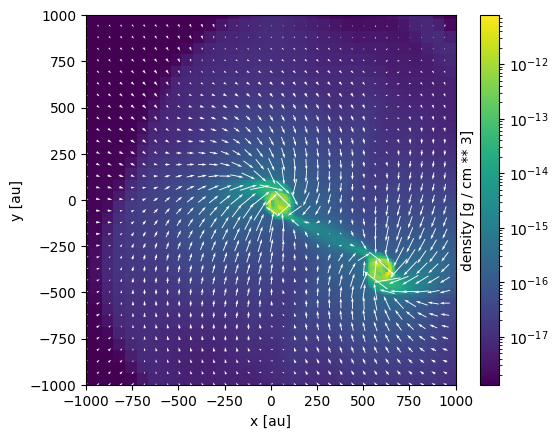
For example, plotting a map of gas density with velocity vectors overlayed as arrows can be achieved by doing
[12]:
osyris.map(
    mesh.layer("density", norm="log"),  # layer 1
    mesh.layer("velocity", mode="vec"),  # layer 2
    dx=2000 * au,
    origin=center,
    direction="z",
)
[12]:
<osyris.core.plot.Plot at 0x7a21555ca7a0>
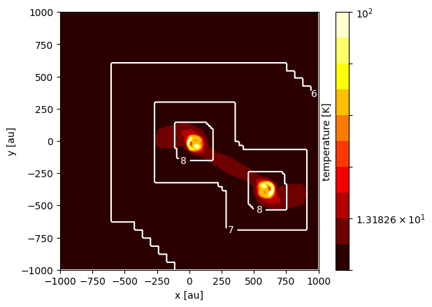
Another example is to overlay contours of the AMR levels onto a map of gas temperature:
[13]:
osyris.map(
    mesh.layer(
        "temperature",
        norm="log",
        mode="contourf",
        levels=np.logspace(0.9, 2, 11),
        cmap="hot",
    ),  # layer 1
    mesh.layer(
        "level",
        mode="contour",
        colors="w",
        levels=[6, 7, 8],
        fmt="%i",
    ),  # layer 2
    dx=2000 * au,
    origin=center,
    direction="z",
)
[13]:
<osyris.core.plot.Plot at 0x7a21552345e0>
Arbitrary orientation#
In the previous examples, all the maps were created normal to the z direction. The orientation can be defined in multiple ways:
'x','y', or'z', to select one of the three cartesian axes as the normal to the planea
Vectorrepresenting the normal to the planea
VectorBasiscomprising 3 vectors fully defining the basis for the map'top'or'side'to choose an automatic top or side view of a disk
Principal XYZ axes#
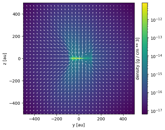
Viewing the system along the x axis is achieved using direction='x':
[14]:
osyris.map(
    mesh.layer("density", norm="log"),
    mesh.layer("velocity", mode="vec"),
    dx=1000 * au,
    origin=center,
    direction="x",
)
[14]:
<osyris.core.plot.Plot at 0x7a215516c220>
Supplying a normal vector#
In this example, we supply a custom vector as the map’s direction:
[15]:
osyris.map(
    mesh.layer("density", norm="log"),
    mesh.layer("velocity", mode="vec"),
    dx=500 * au,
    origin=center,
    direction=osyris.Vector(-1, 1, 3),
    cmap="magma",
)
[15]:
<osyris.core.plot.Plot at 0x7a2154e0beb0>
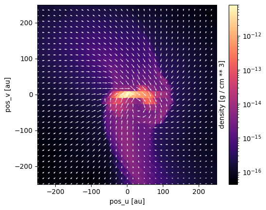
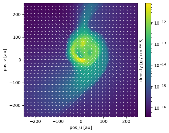
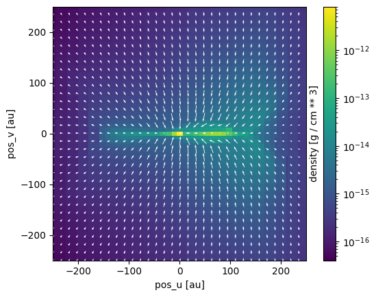
Automatic “top/side” slice orientation according to angular momentum#
Osyris also offers an automatic orientation, based on the angular momentum computed inside a region close to the origin. This is useful for looking at, e.g., disks.
In the following example, we create a 2D slice of the logarithm of density 500 au wide with the "top" direction, to view the disk from above
[16]:
osyris.map(
    mesh.layer("density", norm="log"),
    mesh.layer("velocity", mode="vec"),
    dx=500 * au,
    origin=center,
    direction="top",
)
VectorBasis:
    n: '' Value: -0.002, 0.005, -1.000 [] (), {x,y,z}
    u: '' Value: 0.707, 0.707, 0.003 [] (), {x,y,z}
    v: '' Value: 0.707, -0.707, -0.005 [] (), {x,y,z}
[16]:
<osyris.core.plot.Plot at 0x7a2154e858a0>
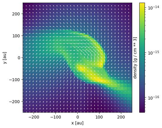
We can also use direction="side" to view the disk from the side
[17]:
osyris.map(
    mesh.layer("density", norm="log"),
    mesh.layer("velocity", mode="vec"),
    dx=500 * au,
    origin=center,
    direction="side",
)
VectorBasis:
    n: '' Value: 0.707, 0.707, 0.003 [] (), {x,y,z}
    u: '' Value: 0.707, -0.707, -0.005 [] (), {x,y,z}
    v: '' Value: -0.002, 0.005, -1.000 [] (), {x,y,z}
[17]:
<osyris.core.plot.Plot at 0x7a2155583160>
Slicing above the origin#
We want to plot a slice of density but through a point which is 20 AU above the centre of the domain. We simply supply a new origin to map:
[18]:
osyris.map(
    mesh.layer("density", norm="log"),
    mesh.layer("velocity", mode="vec"),
    dx=500 * au,
    origin=center + osyris.Vector(0, 0, 20, unit="au"),
    direction="z",
)
[18]:
<osyris.core.plot.Plot at 0x7a2154752bf0>
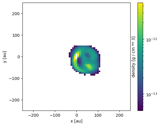
Plot only a subset of cells belonging to a disk#
In this example, we select cells according to their density and plot only those. This is done indexing the mesh data group with only the desired cells.
This is useful for plotting disks around protostars, for example. Here we select the cells with a density in the range \(5 \times 10^{-14}~\text{g cm}^{-3} < \rho < 5 \times 10^{-12}~\text{g cm}^{-3}\).
[19]:
selection = (data["mesh"]["density"] >= (5.0e-14 * osyris.units("g/cm**3"))) & (
    data["mesh"]["density"] <= (5.0e-12 * osyris.units("g/cm**3"))
)

osyris.map(mesh[selection].layer("density"), dx=500 * au, norm="log", origin=center)
[19]:
<osyris.core.plot.Plot at 0x7a21547dfa00>
Computing the disk mass can be achieved via
[20]:
np.sum(mesh["mass"][selection]).to("M_sun")
[20]:
'' Value: 0.282 [M_sun] ()
Sink particles#
Some star formation simulations contain sink particles, and these can be represented as a scatter layer on a plane plot.
[21]:
# TODO: not implemented yet

# osyris.map(
#     {"data": data["hydro"]["density"], "norm": "log"},  # layer 1
#     {"data": data["sink"]["position"], "mode": "scatter", "c": "white"},  # layer 2
#     dx=2000 * au,
#     origin=center,
#     direction="z",
# )
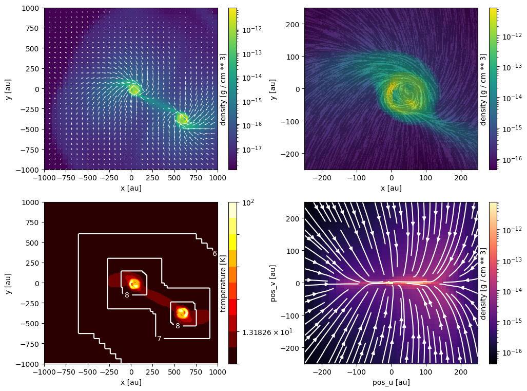
Subplots / tiled plots#
Osyris has no built-in support for subplots (also known as tiled plots). Instead, we leverage Matplotlib’s ability to create such layouts. Osyris plots are then inserted into the Matplotlib axes, using the ax argument.
In the example below, we create four panels and insert various maps.
[22]:
# Create figure
fig, ax = plt.subplots(2, 2, figsize=(12, 9))

# Define region to plot
dx = 2000.0 * au

osyris.map(
    mesh.layer("density", norm="log"),
    mesh.layer("velocity", mode="vec"),
    dx=dx,
    origin=center,
    direction="z",
    ax=ax[0, 0],
)

osyris.map(
    mesh.layer("velocity"),
    mode="lic",
    color=mesh["density"],
    norm="log",
    dx=0.25 * dx,
    origin=center,
    direction="z",
    ax=ax[0, 1],
)

osyris.map(
    mesh.layer(
        "temperature",
        norm="log",
        mode="contourf",
        levels=np.logspace(0.9, 2, 11),
        cmap="hot",
    ),
    mesh.layer(
        "level",
        mode="contour",
        colors="w",
        levels=[6, 7, 8],
        fmt="%i",
    ),
    dx=dx,
    origin=center,
    direction="z",
    ax=ax[1, 0],
)

osyris.map(
    mesh.layer("density", norm="log", cmap="magma"),
    mesh.layer("velocity", mode="stream", color="w"),
    dx=0.25 * dx,
    origin=center,
    direction="side",
    ax=ax[1, 1],
)
VectorBasis:
    n: '' Value: 0.707, 0.707, 0.003 [] (), {x,y,z}
    u: '' Value: 0.707, -0.707, -0.005 [] (), {x,y,z}
    v: '' Value: -0.002, 0.005, -1.000 [] (), {x,y,z}
[22]:
<osyris.core.plot.Plot at 0x7a215422dae0>